|
1/15/19 DESKTOP
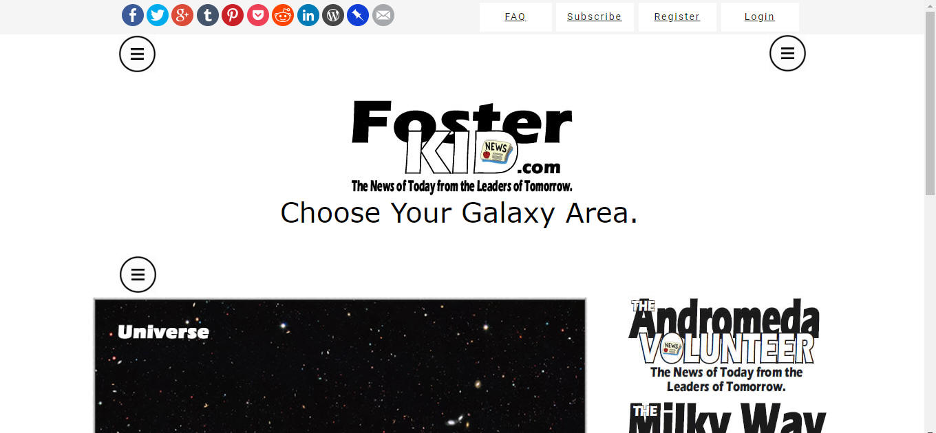
a.) "I for sure want to widen it like I said before at the 100% level", if someone has their setup at 90% or 80% they'll just have to adapt their screen on their own for now Look at how much better it looks when the menus are farther out and just a bit lower. Your page makes it looked bunched up and the menus look better when they are not right under the stuff on the top level. If you notice, I have the menus just on the outside of everything, when scrolling, the menus are never on top of anything and nothing will ever go behind them. They can always stay right where they are. b.) The FAQ, Subscribe etc letters and take off the underline and make them verdana. Make the entire website Verdana.
This is what it should look like.
Below here is old!!!!!!!!!!!!!!!!!!
a.) Below is what the sample website looks like (talking about in width) b.) Below is what your width looks like c.) and below that is what my sample looks like (my map is displaying bigger but the logos look about the same)
ANSWER: make yours widen to make the map display the actual size and the logos display the actual size. Were going to need all of the space possible so lets start by making the main page bigger.
Sample
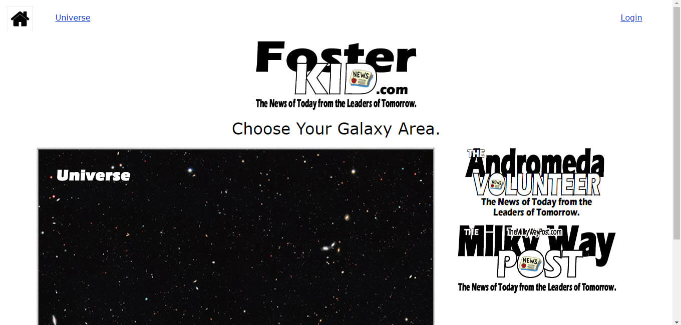
Yours is below (make the 3 line menus spread all the way to the left under the home symbol on the upper left and the one on the right go all the way over to be in the same place as the magnifying glass on the upper right).
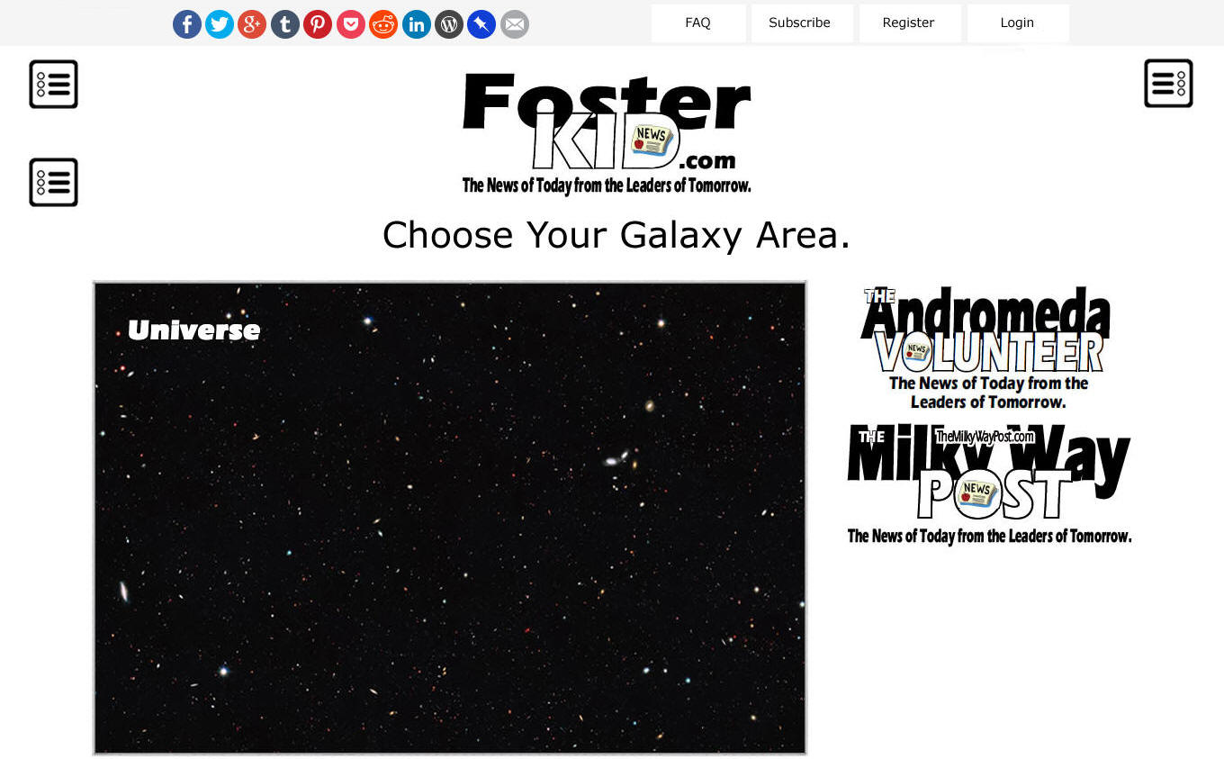
Mine (my map looks bigger)
Below here is old!!!!!!!!!!!!!!!!!!
DESKTOP
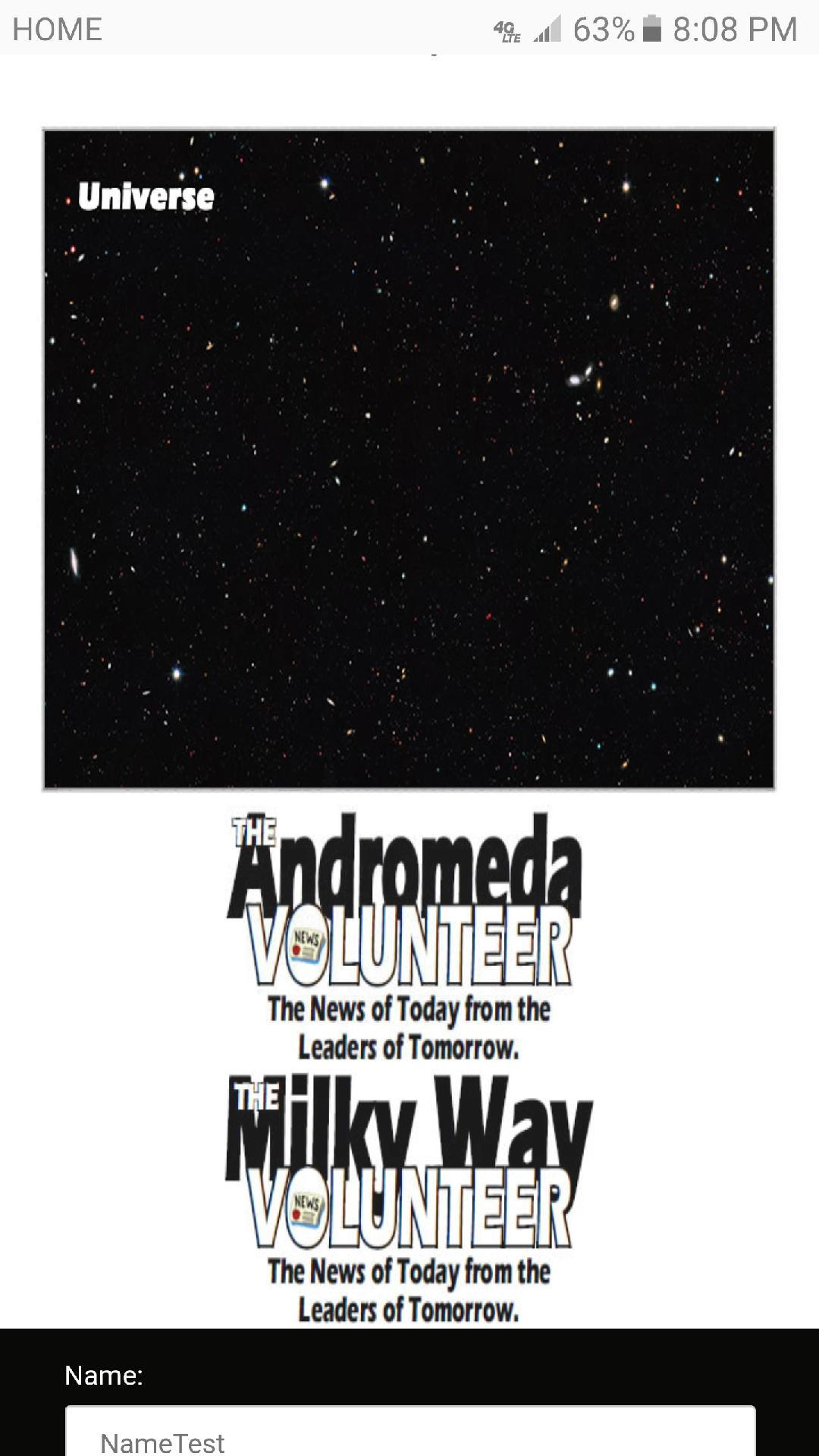
MOBILE Here is the 1st of 3 screen shots from mobile. 1.) Underneath the FAQ there needs to be the same grey space as between the FAQ and the Subscribe, right now there is just white. To the left of FAQ and to the right of Login seems tight also. 2.) the "Choose Your Galaxy Area." is off to the left, make it centered.
Here is the 2nd of 3 screen shots from mobile. 3.) The universe map is stretched 4.) The 2 Logos are stretched and need to big shown as big as the screen, right now they are too small 5.) The logos need some space between them, just a little.
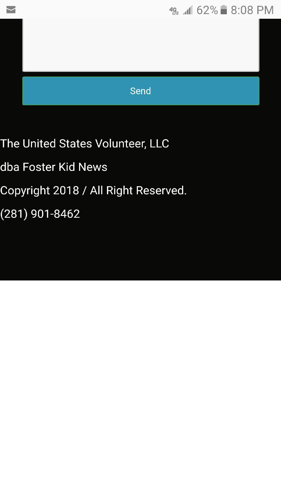
Here is the 3rd of 3 screen shots from mobile. 5.) There is a perfect amount of black space above "The United States Volunteer, LLC". but below my phone number the is double the amount of black space, make them the same amount of space. 6.) delete all of the very light brown space below the black, there is a lot of it
|